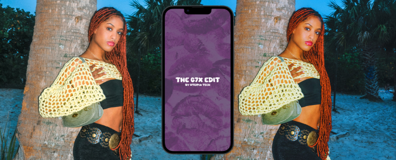
G7X EDIT -APP CONCEPT
G7X Edit is a mobile photo‑transformation app concept designed to recreate the signature Canon G7X aesthetic — a look heavily used by creators for Y2K‑style edits, nostalgic flash photography, and viral visual trends. I designed the full UX/UI, user flow, and wireframes in Figma, and began development of the app structure.
The app was built to give users a one‑tap way to turn regular photos into the “G7X camera look” without needing real camera equipment or complex editing skills.
The IdeaI noticed that the G7X visual trend was exploding across TikTok and Instagram, but actually capturing that aesthetic required 3 things many people don’t have:
• A real Canon G7X camera
• Knowledge of color grading
• Editing apps + filters + manual adjustments
I wanted to simplify this into one action:
Take a photo → Get the G7X look instantly.
The ChallengeRecreating a camera‑specific aesthetic inside a mobile app required combining:
• photography knowledge
• UI/UX design
• visual filter testing
• app functionality
• image processing concepts
• user‑friendly interactions
I had to think like both a designer and a developer:
design a clean, modern, photo‑first interface
build Figma wireframes that feel like a real app
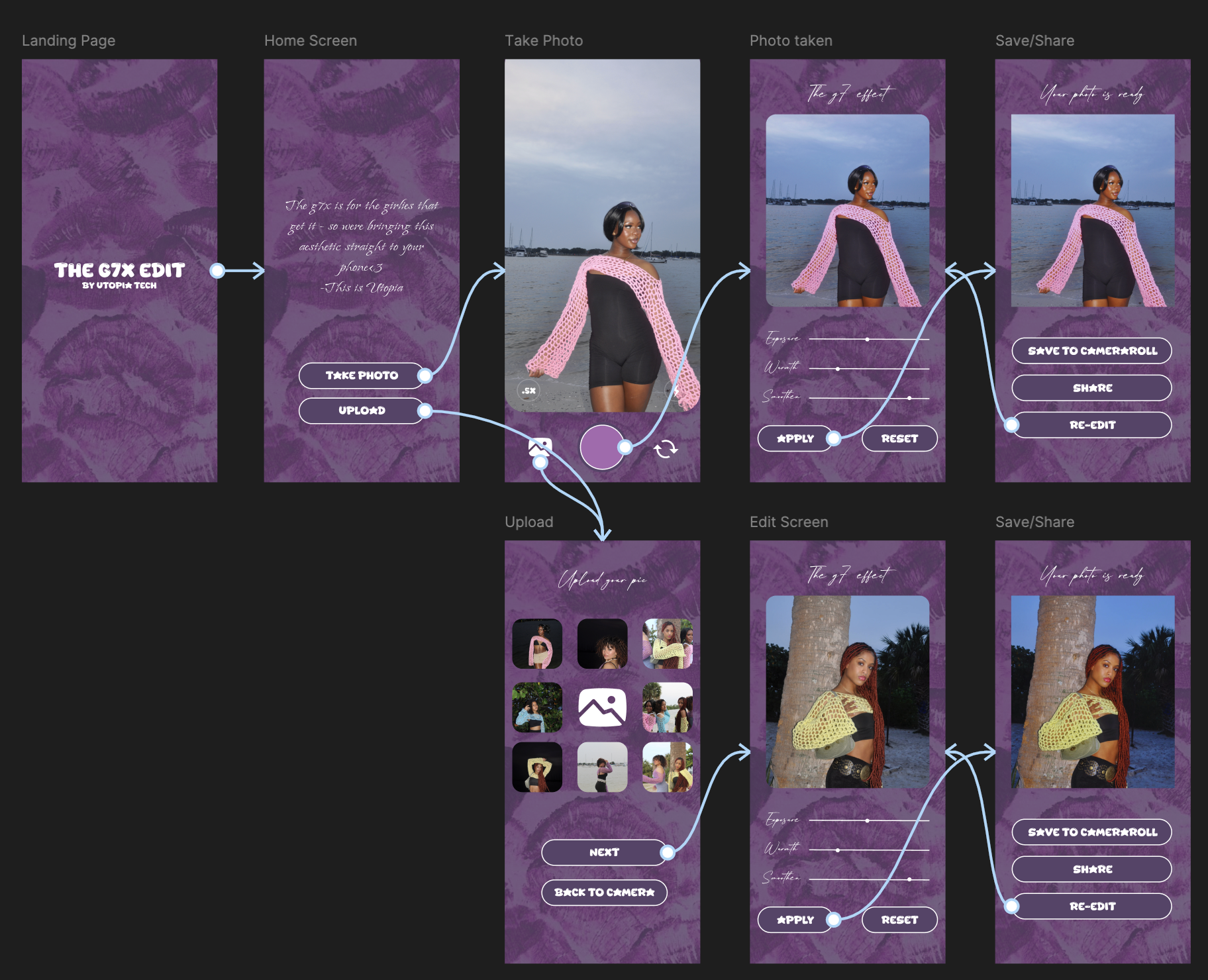
create a transformation flow that feels instant
plan the before/after comparison
mock up realistic G7X color filters
structure the navigation for simplicity
begin building the frontend components
Even though the app is not fully coded yet, the concept, visual system, and UX foundation are complete.
Simplicity + Aesthetic Accuracy
The Strategy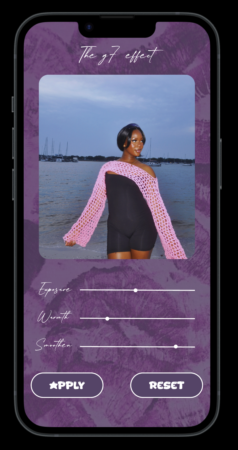
The experience was designed to feel:
fast
intuitive
aesthetically pleasing
camera-focused
The core strategy was:
Realistic G7X style simulation
Simplified user flow (3 steps maximum)
Modern, understated UI
Strong before/after contrast
Creator-friendly sharing options
The message isn’t “use our editing app”
It’s: Create content that looks like it was taken on a G7X.
EXECUTION & PROCESS
Research & Moodboard
I researched G7X visuals, Y2K flash photography, and TikTok content styles, building moodboards to define:
• lighting references
• color tones
• skin rendering
• nostalgic overlays
• UI inspiration
I mapped the full journey:
• onboarding
• camera vs upload flow
• editing tools
• before/after preview
• export options
2. Wireframes & UX
The UI uses:
• a bold purple textured background
• soft handwritten typography
• rounded buttons
• clean slider controls
• photo‑first layout
• a consistent, modern aesthetic
Every screen is optimized for scroll, touch interaction, and minimal friction.
3. High-Fidelity Prototypes
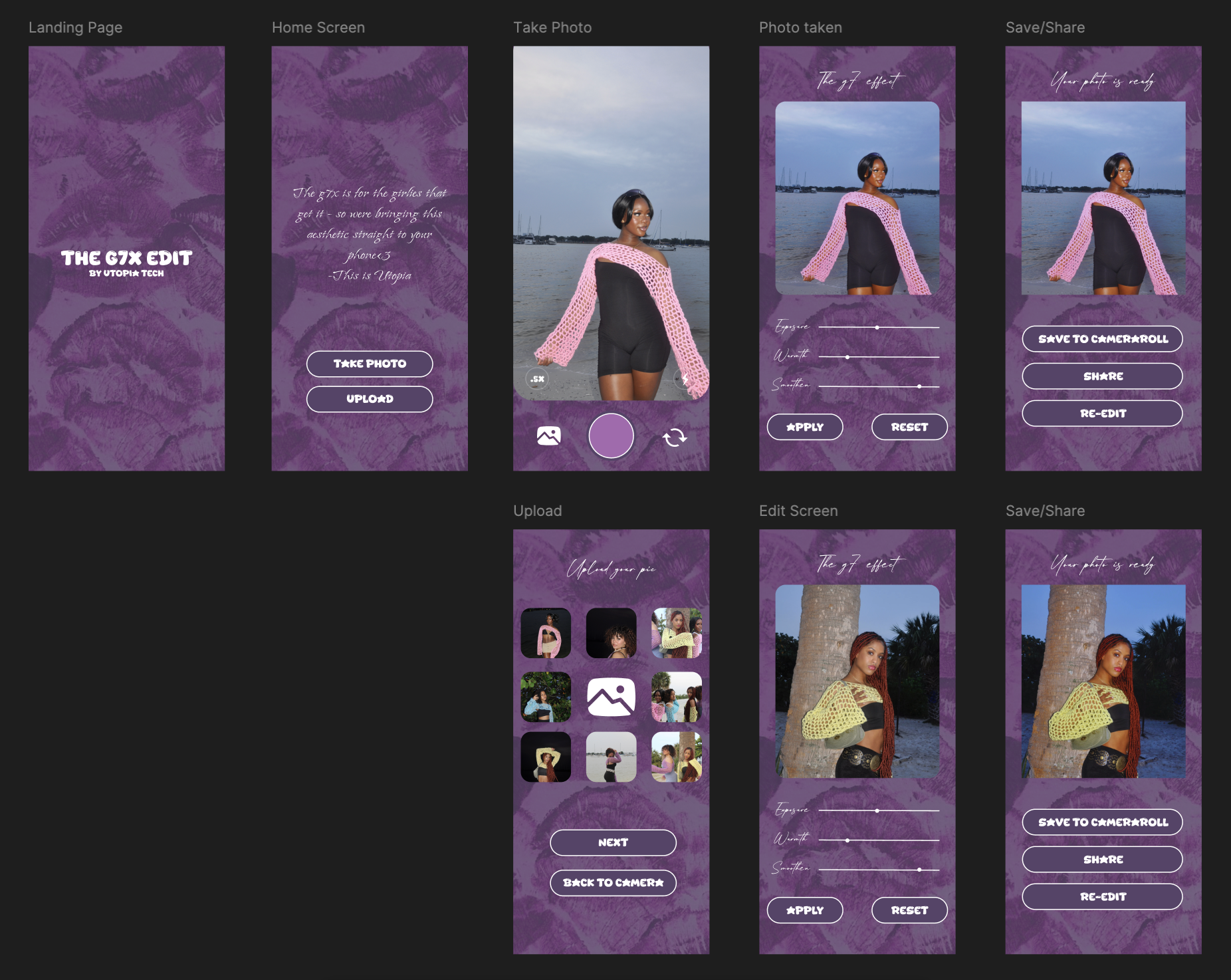
I built a working prototype showing:
• live tap interactions
• editing slider behavior
• full navigation
• export flow
The prototype can be viewed on mobile for a real‑app feel.
4. Interactive Figma Prototype
I began coding the foundation of the app:
screen layout
navigation
camera-access setup
placeholder components for filters and sliders
Tools Used
Figma (wireframes, UI, prototype)
CapCut / Lightroom (tone testing)
Swift / Swift UI (early build)
Pinterest moodboards
5. Early Development
Results and Impact
Product Thinking
This project sharpened my ability to translate a cultural trend into a functional digital product.
UX Focus
I learned that in mobile product design, less is more. Removing features was just as important as adding them to ensure a smooth user experience.
Figma Mastery
I deepened my skills in auto-layout, components, and prototyping.
What I learned